Saturday, August 23, 2014

Workshop with Nancy Tankersley

Workshop with Nancy Tankersley in Easton, Maryland


I love Nancy's paintings and that made me want to take the workshop.  She opened up a new way of thinking about and using photos. 

Nancy's emphasis on using photos as tools and references hit home for me.  She uses the photos to help design the painting, not as something for copying.  Her use of notan and the use of value-viewer added to the useful information. 

The workshop was the perfect balance of demos, instruction, paint time and individual help.  It always takes me some time at home to incorporate new ideas, but you can tell I am glad that I took this workshop. 

Here are links to Nancy's website and info about workshops in Easton, Maryland, a beautiful place and not that far from Fredericksburg, VA.   Plus Nancy is having a show in September in Easton. 

http://nancytankersley.com/works


As time goes on I will add  more details about the workshop. I have to apply some of what I learned and go over my notes a few times. 

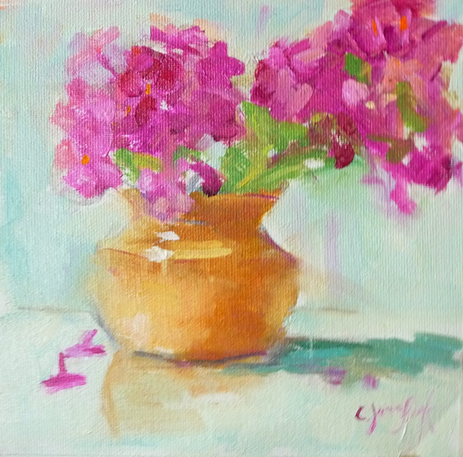
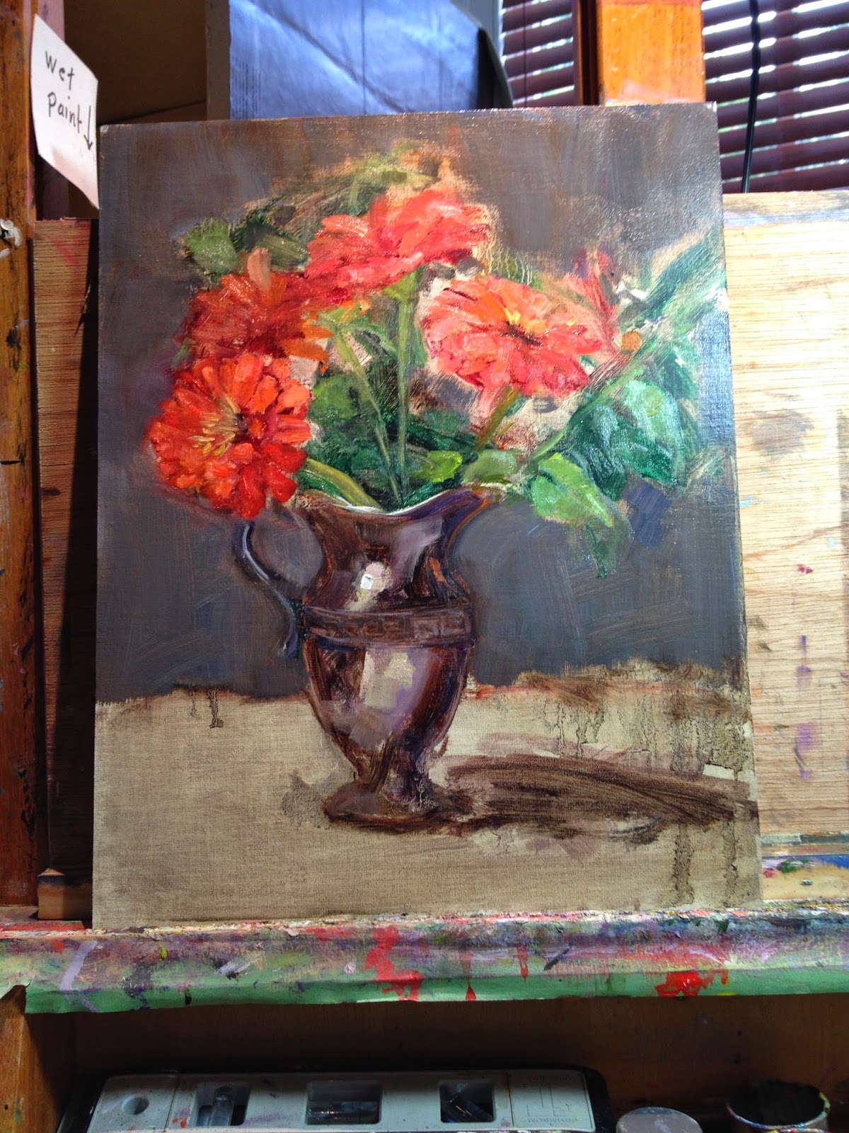
For now here are some of the paintings I worked on in class and the first one I did when I got home. 


In case you have never been to Fredericksburg, Virginia, this was on Facebook and a good look at our city.  It made me want to do more paintings for my "series".  I did an 11 x 14 of William Street in class, but here is the study for it. 

Fredericksburg, Va - Youtube


Monday, August 11, 2014

Color Mixing -Secondary Colors

Limited Palette - August 11, 2014


I like this new way of setting up my palette.  I even got a new palette and moved out some of my colors.  (I will still use all those great colors, but in a different way) 

What I like about this:

     Pre-mixing helps me
     Keeps my colors organized
     Can take better advantage of using warms and cools
     Can keep colors brighter
     Makes for a more harmonious painting
     Make gray out of limited colors which also helps with color harmony

 
I don't know if you can tell, but first I created primaries out of the warm and cool of each color, then I can utilize the warm and cool of each later when thinking about temperature changes in the painting.  Next I created the secondary colors and put them in the middle with tints of each radiating out to the edges.  Also, before starting, I made a pile of gray (top left) out of secondary colors just to insure that painting will be harmonious.  The reason the tints are there is because I try to mix with equal values when making a new mix. 


Start of painting with wash of dark gray
 
 
Refined drawing and strengthened darks.
Started adding color. (background is from the gray made earlier)

Finished painting

Used same palette for this painting and am painting one today of this scene with photo taken from a different direction.  By using the same palette, theoretically these painting should look good together, right?  I hope so. 

Thursday, August 7, 2014

Color Mixing

NOTE:  GIVE-AWAY

( I added an August give-away on the side bar - to enter email me to receive the newsletter that I haven't sent out for months.  I just needed some way of having entries and this idea seemed like a good one.  If you receive the newsletter already, just send me an email with subject line "give-away".  I'll send out a newletter in a month or two to mention my show at Water Street Studio. 


Color Mixing Secondaries - ORANGE       GREEN         PURPLE

Recently I posted a blog about tertiary colors.  This time I am experimenting with secondary colors.  It is a little tedious, but worth it do this kind of practice every once in awhile.  It helps you see another level of color this way.  I always learn something by trying a new combination of colors. 

First do a grid using orange, green and purple and do a value scale with each color by adding white. 

Then mix each secondary with the other two.  You will see some new colors to use.  I think you can get stuck in a rut by using the same colors.


My palette, with three secondaries in the middle to start out with, pre-mixing of tints, then mixing of various intensities. 


COLOR HARMONY

The most important result is how harmonious your paintings will be by restricting yourself to a limited number of colors.   On my palette I used only secondary colors for the painting shown here.  I organize my palette before starting.  I showed more examples of this on an older blog about primary colors. 

Photo used for painting:


Painting (study) done using only secondary colors.  Purple in the sky, green with orange for greenery, low intensity orange (purple added) for building, touched or orange for the path into the painting. 


Saturday, August 2, 2014

Taking Photos of Art

Wow, this was welcome information to me.  Thank you, Lynn, for sending this to me. 

Here is a link to "how to take photos of art"  on youtube.  It was very useful information.  I was so encouraged when I saw that the instructor used a little camera very similar to mine, not a giant and complicated camera that people who know what they are doing use. 

https://m.youtube.com/watch?v=Vpj28da03JQ&autoplay=1

Here is a photo I took using some of what I just learned.  I'm still investigating the "white balance" issue. 

I need to watch this before I take every photo of my art from now on until it is second nature. 

My first photo:
 
I looked at the video again and zoomed in with the camera feature rather than just getting close to the painting.   

This one looks closer to the actual color.  The first photo isn't as accurate in color because the background is more of an apricot color.  I see improvement though. 

Monday, July 21, 2014

Color Harmony - my version of the limited palette


July 21. 2014


I tried some new things this week.  One was starting on a white canvas and the other was a new way of organizing my palette.  I watched a video online at https://artistsnetwork.tv/ by a portrait painter, Joy Thomas, who used a limited palette and pre-mixed using mostly tints (colors mixed with white). 

Two of my students tried the pre-mixing with tints and I think they liked it. 

Organizing the colors not only made mixing a little easier, it also added harmony to the painting.


Joy Thomas (link to this painter's website)

My palette:  I have a lot of colors, but like the limited palette.   I just use these other values of each color to keep colors bright and because I must like to buy paint. 
 
Pre-mixing the tertiary colors that I used in the painting gave me a better chance to stick with the limited palette and create harmony.  I like this way of organizing before you start.  I've used this ever since I watched the video by Joy Thomas.  Sometimes I use only primaries.  I need to try secondary colors only. 


What my palette looked like at the end of the painting.  The colors look so nice together.  I still use my other colors, but mostly for brightening and knocking down the intensity when needed. 

The two painting side by side having used the same limited palette. 


The two paintings done with the same colors.  (The photos above look better)  The one with the phlox below is a little over-exposed and washed out.)  I still have not taken a class in how to take good photos. 

Color is vase is a dull YO, M in flowers, background is mostly BG
Vase is BG, flowers are YO and M is in background

Friday, July 18, 2014

Painting #399

This is a milestone for me, one more painting before reaching 400 on Daily Paintworks.

Plus I am trying something new and that is starting on a white canvas.  We did that in class this week.  Everyone started with a white canvas and did their drawings with charcoal.  The small painting I am showing here started with a wash of UB and BS on a white canvas. 


Monday, July 14, 2014

The Art League of Alexandria, Va


July 12, 2014


 I titled this blog The Art League.  I am trying to decide which class to take there in the Fall.  My goal has been to improve my paintings of children, but overall just improving has always been my goal.  Here is a link the catalog if you are interested. 


The Art League Catalog

When I lived there it was so convenient to take classes from The Art League and there were so many outstanding teachers.  One semester I even took three classes.  Now that I live about an hour away, it is more difficult to drive to Northern Virginia from Fredericksburg. 

I've included notes from some of those classes in past blogs.  One blog was about Robert Johnson (if you use the search button you can find that post).  I took his workshops because I admired his paintings of flowers so much and have been painting some flowers from my garden lately.  Following what I learned from him here is  series of photos that loosely show the steps he uses. 
 
Loose placement of flowers and shadows

 Worked on front flower, continue to work all over canvas
Applied background
 

Decided to use carpet in foreground.  The vase looked better in earlier demo, might go back and rework the vase. 


By the way Robert Johnson has great demos on his website.  http://www.robertjohnsonart.com/Robert_A._Johnson_Art/Demonstrations.html

His book On Becoming a Painter is worth getting, too.  You can purchase it from his website.  I've almost worn out this book which I got autographed when I took the workshop.  I guess I'm a "groupie", at least one who greatly admires this artist's work. 


Monday, July 7, 2014

Last of PB and J series for awhile

July 7, 2014

This is the last painting in my pb an j series.  Between the donuts from Buffalo and the sandwiches the calories have added up to tighter clothes.  My plan is to switch to low calorie paintings for awhile.   Don't forget the paintings of Eileen's Bakery and Café because I bought treats both times I took photos. 

Series of 3


Link to http://sprelly.com/ - best peanut butter ever

Saturday, July 5, 2014

Discovery of homemade peanut butter/nut butter

July 5, 2014

I have been  trying to stick to a schedule of posting at least once/week, usually Mondays on my blog, but today, Saturday, my husband and I made our trip to the Farmer's Market and discovered SPRELLY.  So you might still have time to get there by 2 PM.  I just happen to be a kick of painting peanut butter and jelly sandwiches and this gives it a whole new twist.  They make every kind of peanut butter, nut butter you can imagine.  For today I am trying Cashew butter, tomorrow will be Cashew, coconut, almond butter.  I really should have bought more. 


Link to SPRELLY

Yesterday's painting.


http://www.dailypaintworks.com/artists/carol-josefiak-3555/artwork


 I'm featuring my new collection of dish towels generously given to me by my sister that belonged to our mother.  I did a few paintings while on a trip to Buffalo, all paintings include my new collection of towels.  Donuts are another of my favorite subjects. 

Thursday, July 3, 2014

Daily Paintworks Challenge

July 3, 2014

Happy July 4th!


The Daily Paintworks Challenge was to paint a Peanut Butter and Jelly sandwich, something I have wanted to try for quite awhile so this pushed me to do something new.   I think it would be a good idea to do a number of these and, hopefully keep improving. 

Thank you to Abbey Ryan for designing this challenge.  She does beautiful work.  Here is a link to her blog: http://ryanstudio.blogspot.com/

I saved some step by step photos:

Photo:   (I made the sandwich on frozen bread hoping it would last a little longer without looking too droopy).
 Loose drawing
 Established darks here


I chose blue for my background because it made me think of July 4th so it is a patriotic painting of a PB and J.   I did the reflections to give it a little more interest.  My set-up has a piece of Plexiglas if I want to use it. 
(http://www.dailypaintworks.com/challenge/the-pbandj-challenge/242)
 
I started a board on pinterest for Pbj paintings.  I thought it would make me continue with this subject and work on values plus come up with more ways of setting up the still life.