July 21. 2014
I tried some new things this week. One was starting on a white canvas and the other was a new way of organizing my palette. I watched a video online at https://artistsnetwork.tv/ by a portrait painter, Joy Thomas, who used a limited palette and pre-mixed using mostly tints (colors mixed with white).
Two of my students tried the pre-mixing with tints and I think they liked it.
Organizing the colors not only made mixing a little easier, it also added harmony to the painting.
Joy Thomas (link to this painter's website)
My palette: I have a lot of colors, but like the limited palette. I just use these other values of each color to keep colors bright and because I must like to buy paint.

Pre-mixing the tertiary colors that I used in the painting gave me a better chance to stick with the limited palette and create harmony. I like this way of organizing before you start. I've used this ever since I watched the video by Joy Thomas. Sometimes I use only primaries. I need to try secondary colors only.

What my palette looked like at the end of the painting. The colors look so nice together. I still use my other colors, but mostly for brightening and knocking down the intensity when needed.

The two painting side by side having used the same limited palette.

The two paintings done with the same colors. (The photos above look better) The one with the phlox below is a little over-exposed and washed out.) I still have not taken a class in how to take good photos.
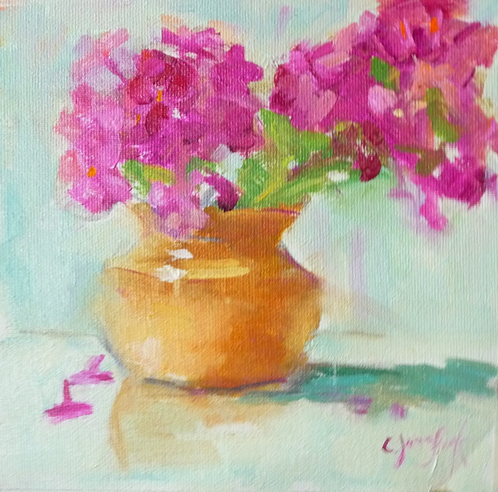
Color is vase is a dull YO, M in flowers, background is mostly BG


No comments:
Post a Comment