Showing posts with label limited palette. Show all posts

Wednesday, January 14, 2015

Primary Palette

January 14, 2014

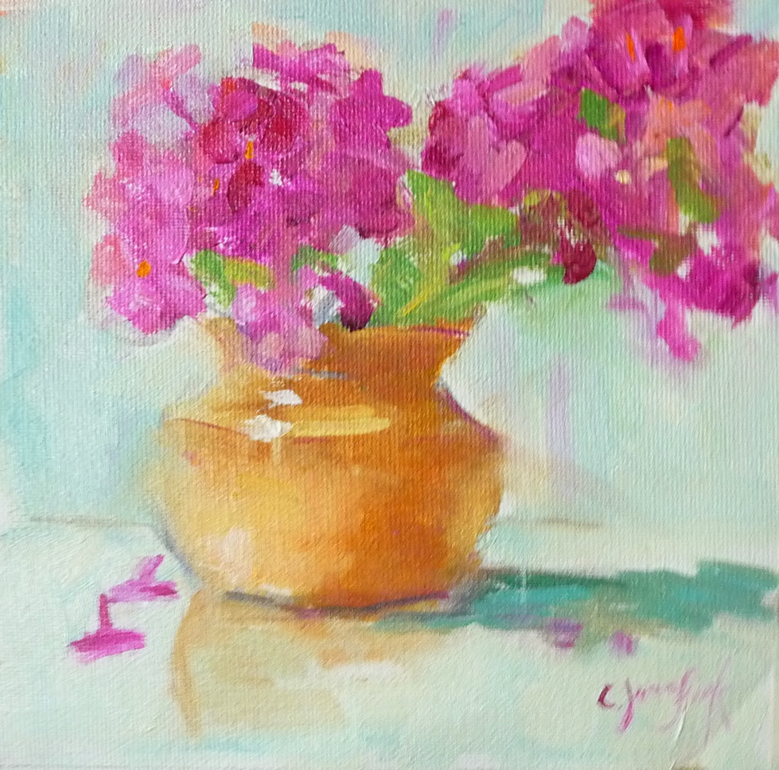
Playing around with the limited palette of three primaries

My last three paintings have been done using the primary palette, just three colors plus white.  I'm starting to really like it.  In the past I have used the split primary with a warm and cool of each color. Then I tried the Zorn palette for awhile.   It's fun to try new things.  Plus I'm making an effort to limit the brushwork. 


Monday, July 21, 2014

Color Harmony - my version of the limited palette


July 21. 2014


I tried some new things this week.  One was starting on a white canvas and the other was a new way of organizing my palette.  I watched a video online at https://artistsnetwork.tv/ by a portrait painter, Joy Thomas, who used a limited palette and pre-mixed using mostly tints (colors mixed with white). 

Two of my students tried the pre-mixing with tints and I think they liked it. 

Organizing the colors not only made mixing a little easier, it also added harmony to the painting.


Joy Thomas (link to this painter's website)

My palette:  I have a lot of colors, but like the limited palette.   I just use these other values of each color to keep colors bright and because I must like to buy paint. 
 
Pre-mixing the tertiary colors that I used in the painting gave me a better chance to stick with the limited palette and create harmony.  I like this way of organizing before you start.  I've used this ever since I watched the video by Joy Thomas.  Sometimes I use only primaries.  I need to try secondary colors only. 


What my palette looked like at the end of the painting.  The colors look so nice together.  I still use my other colors, but mostly for brightening and knocking down the intensity when needed. 

The two painting side by side having used the same limited palette. 


The two paintings done with the same colors.  (The photos above look better)  The one with the phlox below is a little over-exposed and washed out.)  I still have not taken a class in how to take good photos. 

Color is vase is a dull YO, M in flowers, background is mostly BG
Vase is BG, flowers are YO and M is in background

Monday, May 19, 2014

Color Board - Anders Zorn

May 19, 2014

I have long admired the work of Anders Zorn, but have been too cheap to buy a book showing his art.  A fellow artist reminded me about him so I did a little research and found an exercise similar to Richard Scmid's color boards.

Anders Zorn is known for his limited palette of yellow ochre, cad red,  ivory black and white.  According to what I read he may have also used cerulean blue and viridian.  I just can't get very good green without using the CB or V.

I'm almost finished with the grids of mixing every color with every other color.  It has been worth doing because it reminded of colors that I should use more often.  I think you can get into the habit of using the same mixes that become your favorites.  Doing the exercise gave a new way of thinking about color even if I don't stick with that limited palette. 

Colors I used:


Not finished yet, but will post the finished one with better labeling soon.  (I got so excited about doing this that I thought maybe somebody else might want to give it a try and get started right away).


More info at this link: http://www.bing.com/images/search?q=Zorn+Palette+Color+Chart&Form=IQFRDR

Friday, October 11, 2013

Color Mixing

# 4

Mixing Secondary Colors taking advantage of color bias-  these exercises are  from the class I took with  artist Caroline Jasper who has written several books on color.  (listed in previous blog and shown on my pinterest board about color theory)


Materials needed:

Canvas paper

Paints:

cad yellow light (or lemon yellow)  COOL because it has some green in it
cad yellow medium  - WARM because it leans toward orange

cad red light  WARM because it leans to orange
alizarin  COOL  because it leans to blue

cerulean blue -   COOL because it leans to green
ultramarine blue   WARM  because it leans towards red

1.  The limited palette called the "split primary", a warm and cool of each of the primary colors.  I like using this palette because the color biases help you in creating the brightest colors when you need them.

 
Mixing the warm and cool of each primary creates what we know as primary red, yellow and blue.


The following exercises take advantage of the bias of the primary colors.   The chart shows the mixes of warm yellow (cad yellow med) and cool yellow (cad yellow light or lemon yellow)  mixed with the warm red (cad red light)  and cool red (alizarin)


Mixing the warm red and warm yellow makes the brightest orange .  Notice when you use the cool red that has blue in it and the yellow that has green it, you get the dullest orange. 


These charts also take advantage of color bias for the best green.  The bluish red (alizarin) mixed with the reddish blue (ultramarine) makes the best purple. 


Recent painting using the limited palette.  Lots of warms and cools used here. 


Tuesday, October 8, 2013

#3 - Get to know your colors


Exercise #3 - Color - more to come about color mixing, but first get to know your colors

This exercise I did in a class I took with Caroline Jasper quite a few years ago. 

She has written several books on color, Painters' Guide and Color Manual and Power Color, posted on my pinterest board about color theory. 

The purpose was to get to know your colors:

(arranged according to value rather than color wheel) - more about that later


Materials: 


6 tubes of paint in the following colors:  (These are the ones I use for the limited palette).  There are several more exercises using these colors. 

SPLIT PRIMARY PALETTE:

cad yellow light
cad yellow medium

cad red light
alizarin red

cerulean blue
ultramarine blue

On the first day of the workshop we did swatches of each of our colors from the limited palette. 

 1. Cut out 6 pieces of canvas paper 2 inches by 4 inches.

2.  Paint half with full strength paint, then use some odorless mineral spirits to thin the paint on the edges of the block of color. 

3.  Write information about each color on the back, e.g., name, opacity, transparency, etc, info that you get from the label on the paint tube. 

Caroline then asked us to arrange the colors according to value.  (pictured here).  We then took a photo in black and white to see if our values were correct.