Showing posts with label color mixing. Show all posts

Thursday, April 30, 2015

Mixing Greens

April 30, 2015


Mixing Greens


Whenever painting outside   (and inside, too), I pre-mix my greens.  It is kind of a security blanket for me.   Using a limited palette, I create a super dark, top right, for accents, then three values, warm and cool of each.  I use these as a reminder to stick to the three values and include temperature changes in both shadow and light sides.  I use these as starter puddles and work off of them. 

I didn't take a photo of the mixes for the azaleas, but used the same idea for the pinks and the whites.  You can see how there are temperature changes in each value change of the azaleas. 


It helps me to have a structure on my palette, otherwise I start mixing wildly and lose the value differences.

In the following photos, you can see how I started with the accent color first, putting down the darks, then went to the middle value, and at the end added the lights. 

First steps:  toned with Quinacrodone red ( permanent rose) because I wanted the azaleas to read with the strongest color.  Color on color make for the most vibrant area.  Drawing of big shapes.

 
Massed in the big shapes, started adding some middle values. 
 

Ready for final touches that will give it some twinkle, using the lightest values that are pre-mixed. 
 

Monday, August 11, 2014

Color Mixing -Secondary Colors

Limited Palette - August 11, 2014


I like this new way of setting up my palette.  I even got a new palette and moved out some of my colors.  (I will still use all those great colors, but in a different way) 

What I like about this:

     Pre-mixing helps me
     Keeps my colors organized
     Can take better advantage of using warms and cools
     Can keep colors brighter
     Makes for a more harmonious painting
     Make gray out of limited colors which also helps with color harmony

 
I don't know if you can tell, but first I created primaries out of the warm and cool of each color, then I can utilize the warm and cool of each later when thinking about temperature changes in the painting.  Next I created the secondary colors and put them in the middle with tints of each radiating out to the edges.  Also, before starting, I made a pile of gray (top left) out of secondary colors just to insure that painting will be harmonious.  The reason the tints are there is because I try to mix with equal values when making a new mix. 


Start of painting with wash of dark gray
 
 
Refined drawing and strengthened darks.
Started adding color. (background is from the gray made earlier)

Finished painting

Used same palette for this painting and am painting one today of this scene with photo taken from a different direction.  By using the same palette, theoretically these painting should look good together, right?  I hope so. 

Thursday, August 7, 2014

Color Mixing

NOTE:  GIVE-AWAY

( I added an August give-away on the side bar - to enter email me to receive the newsletter that I haven't sent out for months.  I just needed some way of having entries and this idea seemed like a good one.  If you receive the newsletter already, just send me an email with subject line "give-away".  I'll send out a newletter in a month or two to mention my show at Water Street Studio. 


Color Mixing Secondaries - ORANGE       GREEN         PURPLE

Recently I posted a blog about tertiary colors.  This time I am experimenting with secondary colors.  It is a little tedious, but worth it do this kind of practice every once in awhile.  It helps you see another level of color this way.  I always learn something by trying a new combination of colors. 

First do a grid using orange, green and purple and do a value scale with each color by adding white. 

Then mix each secondary with the other two.  You will see some new colors to use.  I think you can get stuck in a rut by using the same colors.


My palette, with three secondaries in the middle to start out with, pre-mixing of tints, then mixing of various intensities. 


COLOR HARMONY

The most important result is how harmonious your paintings will be by restricting yourself to a limited number of colors.   On my palette I used only secondary colors for the painting shown here.  I organize my palette before starting.  I showed more examples of this on an older blog about primary colors. 

Photo used for painting:


Painting (study) done using only secondary colors.  Purple in the sky, green with orange for greenery, low intensity orange (purple added) for building, touched or orange for the path into the painting. 


Monday, July 21, 2014

Color Harmony - my version of the limited palette


July 21. 2014


I tried some new things this week.  One was starting on a white canvas and the other was a new way of organizing my palette.  I watched a video online at https://artistsnetwork.tv/ by a portrait painter, Joy Thomas, who used a limited palette and pre-mixed using mostly tints (colors mixed with white). 

Two of my students tried the pre-mixing with tints and I think they liked it. 

Organizing the colors not only made mixing a little easier, it also added harmony to the painting.


Joy Thomas (link to this painter's website)

My palette:  I have a lot of colors, but like the limited palette.   I just use these other values of each color to keep colors bright and because I must like to buy paint. 
 
Pre-mixing the tertiary colors that I used in the painting gave me a better chance to stick with the limited palette and create harmony.  I like this way of organizing before you start.  I've used this ever since I watched the video by Joy Thomas.  Sometimes I use only primaries.  I need to try secondary colors only. 


What my palette looked like at the end of the painting.  The colors look so nice together.  I still use my other colors, but mostly for brightening and knocking down the intensity when needed. 

The two painting side by side having used the same limited palette. 


The two paintings done with the same colors.  (The photos above look better)  The one with the phlox below is a little over-exposed and washed out.)  I still have not taken a class in how to take good photos. 

Color is vase is a dull YO, M in flowers, background is mostly BG
Vase is BG, flowers are YO and M is in background

Monday, June 2, 2014

Color Mixing - Intensity

June 1, 2014

Color Mixing - I have learned that to make color look bright there is a need for mixing low intensity colors, too.  Colors (with high intensity or chroma) look brighter against neutrals and low intensity colors. 

I have been  watching videos from  the Artist Network TV  and Ian Roberts has a good one on color.  There was an exercise he recommends called the "color chip exercise". 

Attributes of every color include HUE, VALUE and INTENSITY.  The following exercise emphasizes learning to mix low intensity colors.  I usually went for the hue first, then added the complement and took it from there. 


1) Get paint chips from hardware store with low intensity.  I chose sort of a yellow, purple, green, and blue in different values.


This just show different values.

Exercise - glue chip to grid, match  as closely as possible in value and intensity with your own mix in 2nd grid,  the do the same thing in the 3rd grid with the color's complement. 

This black and white shows the similarity in value. 


I hope you can watch the Ian Roberts video.  I have written about Ian Roberts in older blogs especially his book on composition.  He explains so well the reasons there are for being able to adjust the intensity of colors especially in landscape painting. 

My next blog is about color brightness using Dreama Tolle Perry's technique of transparent and opaque colors.  I finally remembered to take step by step photos for one my recent paintings called "Corner of Fauqier and Charles. 

http://www.dailypaintworks.com/artists/carol-josefiak-3555/artwork 

Thursday, January 30, 2014

Learn to Paint

January 30, 2014

Part of my reason for having a blog is to include lessons and exercises that will help someone learn to paint, but with blogs that information gets lost in the archives.  I was thinking that a "search button" on my blog would help with that problem.  I hate to admit this, but I  installed one awhile ago, but forgot that it was there.  I moved it to the top right of this page.  I checked it out and it really does work.

There are  lessons embedded in old archives. 

Search for:

value
color mixing
how to start a painting
demo
color boards
exercise
Temperature
Edges
painting loosely

 (other search words work, but I know these do)

The topics are on one of my pinterest boards, too.  (Click on "pinterest")


Emphasis on loose brushwork - listed on Daily Paintworks

(This reminds me of the wonderful pies my mother used to make.  The napkins belonged to my grandmother.  It is a very sentimental painting for me.    My daughter-in-law has tried to teach me to make pie crust.  She makes great pies, too, and so does my son.  I am better at eating pie. 

Wednesday, November 20, 2013

More about pet portraits

November 20, 2013

Steps for painting a pet portrait


Yesterday our class topic was painting pet portraits.  I am so proud of their paintings.  This was the first time they painted animals.  Great job!


They did such good drawings.  We were just about the start Step 2.


Step 1 - The Drawing - covered in the last blog, but can be summed up in one word:  MEASURE


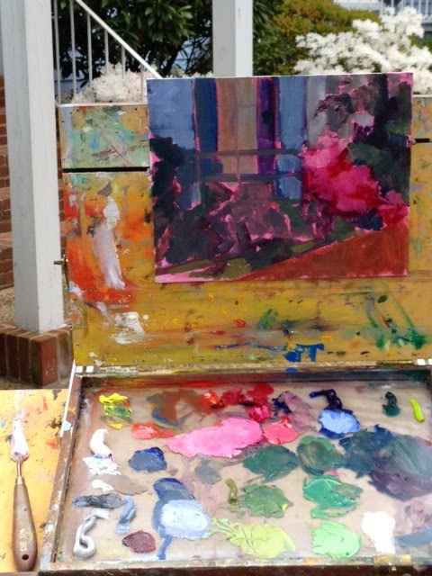
Step 2 - Color Mixing -  even though most dogs and cats are shades of brown, black and/or white, there is a lot of color mixing going on for these paintings.

My approach:

 mix several values of the general hue

mix two temperatures of each value

then depending on the value of the dog I create four more piles of paint to have on my palette of red, yellow and blue plus one pile of the complement of the pet's color mixed with white.  If the dog is a dark color you would use darker values of RYB. 

The colors on bottom left  are for a brown dog (the photo on my monitor make the lightest value look too orange.)  The white demonstrates the brushwork, pulling the brush to the outside. 


VARIETY
 The reason I have the RYB and complement available is to be sure to include variety in the fur color.  For each brushstroke, I mix a little of  one of those piles, otherwise the fur looks flat. 


For example,   on the light side of a white pet,  not only would I consider the temperature, but also include some variety with RYB and the complement.

You can see some of this going on in the photos especially in the last blog's photos. 


BRUSHWORK -  to create the look of fur brush from the inside of the form to the outside leaving soft edges and letting the brushstrokes show creating the look of fur.

Last bit of advice:  maintain the darks even in a white pet.  Beyond light, middle and dark, keep the dark accent color and there may even be a fifth value for a highlight.

EYES:

Here's where having a good photo is important.  I have done commissions where the photos given to me had "red eyes".

-show transparency in the eye by using a lighter color on the bottom of the iris and include a little shadow under the eyelid plus add a highlight at the end.


Bottom of the eye shows transparency of the eye and shadow under the lid


Monday, October 28, 2013

More about color mixing

Color Mixing


One last exercise for color mixing. (also a form of meditation, at least for me) 

One of the first books I bought when I started to paint was Alla Prima  by Richard Schmid.  He recently published an updated version which is #1 on my wishlist for Christmas.  He said on of his teachers required that he do these color charts before he started to use color in his paintings.  I was so inspired by his book that I took on the challenge. 

I've had these boards for years now and still refer to them and they really helped me with color mixing. 


The concept is to decide on your palette, then mix each color with every other color:

(Link to photos of Richard Schmid's color boards on pinterest_http://www.pinterest.com/josefiak/learn-to-paint/   


1.  Use tape to create a grid.  I used 12 x 16 inch panels. 

2.  Start with the full strength color in the top row, then gradually add white in increasing amounts.
     (TINTING)

3.  Make a color board for each color on your palette.  For example, to do the cad red light board, you will mix cad red light with every other color on your palette.  The photos show it best. 


It will take awhile, but not only will you learn a lot, but it is like meditation to do these boards. 

Wednesday, October 23, 2013

How to keep colors bright and clean

Mixing colors:  How to brighten colors and keep them looking clean

(I'm listing the learn to paint posts on pinterest )-eventually they will be in order 1-?

WHY:  Bright highly saturated colors come forward.  There is still a need for duller (less saturated colors, the ones that you want to recede or be less important. 

1.  When mixing colors keep the color bias in mind. ( Refer back to earlier blog about that)

2.  If you want to lighten a color, go to the neighbor (analogous color) on the color wheel that is lighter before using white.  For example, to make red lighter, go to cad red light first, then to orange and even yellow.  White will lighten, but also dull and cool a color. 


Mixes of red on the left are made with analogous colors and ones on right use the complement (green) for the dark value, red for the middle, and red mixed with white for the lightest value


Bright vs. dull

You see the differences with this close-up


Which two are the brightest? 


3.  If you want to darken and keep bright, also go to the neighbor on the color wheel.  For example, cerulean blue can be made darker with UB or viridian.  With red, the alizarin or magenta will darken yet keep the color bright.

Keeping colors clean


1.  When mixing use a palette knife vs a brush.  Keep the palette knife wiped off when you change a color.


2.  Keep brush clean by using a paper towel to pull excess paint off rather than dipping into odorless mineral spirits.  The oms will leave a mix on the brush that contaminates your next brush stroke. 
Dipping a brush into a color tends to leave a little paint behind and contaminate the color. 

Please visit my facebook page


Recent painting:  I needed bright colors, unsaturated (dull) colors, neutrals, a little bit of everything here.


Tuesday, October 15, 2013

#5 Color Mixing - Complementary colors

Objectives of this Exercise: 
                   How to darken a color
                   How to dull a color
                   How to mix grays

 This exercise is designed to show how to darken a color and dull a color and how to mix interesting neutrals (grays).


Use three sets of complementary colors:

 *how to mix the best (brightest) oange, green,  and purple is on the previous blog post. 

red
green

blue
orange

yellow
purple


Make a grid like the one in the photo.
Start with complementary colors at top and bottom, then gradually add increasing amounts of the complementary color,  When you reach the middle the result will be unidentifiable as either complement.  The result will be a neutral (gray) color that will often need to use in your paintings.

Notice there are two columns for each set of complements.  The second column is a "tinted" version of the first column achieved by adding white to the colors mixed in the first column. 


The first time you add a little of the complement is get darker and duller and this continues until you reach the middle (the fourth from the top grid where the color looks "muddy", dull and gray. 

Don't worry about making this perfect.  What counts is getting the concept of how to make a color darker by using its complement and seeing how you can predict what happens to color.
a lot of grays used here
dark dull yellows also used

Friday, October 11, 2013

Color Mixing

# 4

Mixing Secondary Colors taking advantage of color bias-  these exercises are  from the class I took with  artist Caroline Jasper who has written several books on color.  (listed in previous blog and shown on my pinterest board about color theory)


Materials needed:

Canvas paper

Paints:

cad yellow light (or lemon yellow)  COOL because it has some green in it
cad yellow medium  - WARM because it leans toward orange

cad red light  WARM because it leans to orange
alizarin  COOL  because it leans to blue

cerulean blue -   COOL because it leans to green
ultramarine blue   WARM  because it leans towards red

1.  The limited palette called the "split primary", a warm and cool of each of the primary colors.  I like using this palette because the color biases help you in creating the brightest colors when you need them.

 
Mixing the warm and cool of each primary creates what we know as primary red, yellow and blue.


The following exercises take advantage of the bias of the primary colors.   The chart shows the mixes of warm yellow (cad yellow med) and cool yellow (cad yellow light or lemon yellow)  mixed with the warm red (cad red light)  and cool red (alizarin)


Mixing the warm red and warm yellow makes the brightest orange .  Notice when you use the cool red that has blue in it and the yellow that has green it, you get the dullest orange. 


These charts also take advantage of color bias for the best green.  The bluish red (alizarin) mixed with the reddish blue (ultramarine) makes the best purple. 


Recent painting using the limited palette.  Lots of warms and cools used here. 


Sunday, March 31, 2013

color boards

 
These are the colors boards that I talked about on an earlier post.  The idea is to make one for every color on your palette.  The first board is the basic palette, then each successive board starts with a different color from your palette until you have one board for each color.  The color is full strength on the top row, then tinted with white, (I used titanium).
 
Reasons for doing this:
 
Helped me become familiar with my colors and get to know them.
 
 
Helped me understand value
 
Helped with color mixing
 
Helped with using a brush  ( you can do these with a palette knife, too, then it helps with using a palette knife)
 
I'll post more of the boards in the next few days. 
 
If you have any questions, just e-mail me or use the comment box.  These helped me a lot and my students at least say they like them.